Full article with thanks to https://www.heytherehome.com/8-tips-choosing-right-paint-color/
1- Don’t Pick Your Paint Colour First.
I know it seems natural to get the biggest things done first, but it is much easier to choose a paint colour that goes with your furniture and decor than it is to choose decor to go with a paint colour.
2-Start With An Inspiration.
Pinterest is a great place to start when deciding on paint colors. Make a board for each room and start pinning rooms that catch your eye. Once you have about 10 you’ll get a feel for what you are drawn to color and style wise.
Would you believe that the inspiration for the wall colour that is in 90% of my home came from a Starbucks coffee mug? Yep!
I love grey but I didn’t want my house to feel cold (or like a prison cell) so I went for a greige that had just enough warmth that my slate grey furniture and accessories go with it, but would still feel warm.
And in my son’s room the inspiration came from a baby blanket I had received when I was pregnant with him. I used it as a starting point to select fabrics in blues and greens and then chose a really light, but bright green for the walls. Even thought it is green, it still plays as a neutral because everything else in the room is the star, not the walls.
which leads me to my next point…
3- Stick With Neutrals.
Now I’m not saying avoid colour all together. Colour is good, but you have to first decide where you want the attention in a room to go. If your answer is the walls, then heck, go bold. And if you go bold on the walls everything else in the room should be pretty neutral so that you don’t end up with too many things competing. This is why bold color in a bathroom can work so well because most everything else in a bathroom is already neutral (white). I shared 12 neutral paint colours to get you started in this post.
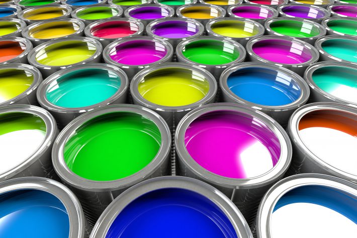
4-Use Testers.
Buy testers in a few colours/ shades and paint a large enough area on a few different walls so that you can see how the light hits it at different times of the day. Try your best not to test your paint against white walls cause it will throw the colour off. If you have to, just do a larger test area to get a better feel.
Almost all of the brands now have testers available for a few bucks. It is well worth spending the money to buy a few to test in your space before purchasing gallons of the colour. Plus the leftover samples are great for touch up and other small painting projects.
Leave the test areas up for about a week so that you can see what the colour will look at different times of day and in different light.
*Tip: Instead of painting an entire (open concept) living space all one colour, break it up by painting some rooms or accent walls a few shades lighter or darker on the same colour strip. This will add some depth to a space. (Also mentioned in tip 8.)
5- Test Your Paint Colours Against Furniture And Fabrics.
Don’t only test your colours on the wall. Instead, paint a piece of poster board and hold it up against your sofa, table or other items that will be in the room to see if goes. You don’t necessarily want to match, but you do want the undertones to go nicely.
6- Pick The Right Sheen.
Any sheen in a paint will accent flaws, so if you are trying to mask flaws go with as little sheen as possible.
Here are some general guidelines for the different finish choices:
- Flat (Matte): No shine at all. Perfect for for low traffic areas like living rooms and bedrooms, as well as ceilings.
- Flat Enamel: Has almost no shine but is a bit easier to clean than flat paint. This is also perfect for low traffic areas but may be a better choice if you have kids or pets.
- Eggshell Enamel: Has a tiny bit of shine and is a good choice for moderate traffic areas such as living rooms. In my experience most scuffs can be wiped off of this surface with a damp cloth.
- Satin Enamel: Has a bit more shine and works well in high traffic areas or areas that have moisture. It is also super wipeable which is why it is perfect for kitchens and bathrooms.
- Semi-Gloss Enamel: Shiny but not glass-like. This is what you should use on cabinets and trim, or in really high moisture areas.
- Hi-Gloss Enamel: Shiny! This gives an almost glass-like finish and is perfect for high use surfaces (like a railing) or furniture.
7- Understand Undertones:
Use the darkest colour on the strip to discover the true color. This will save you from ending up with paint that is too pink, too blue, too yellow, etc.
8-Have A Colour Theme Throughout Your Home.
I don’t mean you have to paint your entire house the same colour, but especially in rooms that open into one another consider what each room will look like when standing in another. If you are going to play it safe and go with one colour, I would suggest that you at least go a few shades lighter or darker in one room or even on one focal wall. It is a great way to add depth and interest to a space.
Model homes are a perfect example of having a colour theme throughout a home. They typically keep the main living space wall colour neutral and use fabrics and accessories to add colour. Then in the bedrooms they may have the accent colours from the living space on the walls and keep the bedding neutral. Of course, kid bedrooms don’t always follow this rule, but they shouldn’t have to right?
Full article with thanks to https://www.heytherehome.com/8-tips-choosing-right-paint-color/