Full article with thanks to https://www.dvdinteriordesign.com/blog/home-office-paint-colours-designers-use-again-and-again
PAINT COLOURS FOR YOUR HOME OFFICE
When working from home, often our work areas are planned and created primarily as an afterthought. But they shouldn’t be. You need to create a space that will support you and help you stay on task and productive. Did you know that your paint colour not only finishes the room but it can be the finishing touch that makes your home a productive workspace and learning environment?
In today’s environment, the home office is a necessity. Whether it is functioning as a replacement office or satellite, you need to plan your space. Many times we are also planning for remote learning, for schoolchildren and adults! (this year has accelerated the need) for the work-from-home trend all across the country, and now builders are starting to provide home–office packages as part of new home options.
UPDATED HOME OFFICE: We use to be excited about the versatility of a laptop. We can work anywhere we want to, but we shouldn’t. The sofa, and dining room table are the typical go-to locations, but now we are shifting to be more deliberate with the location we choose to work at home, as we spend more time at home working! And all those Zoom/ Web-Ex calls dictate the need for a space that is quiet and with a door, so as to not be disruptive to the other people living with you. So hopefully you’ve moved to claim a corner, a room, or even a closet to spend your days, someplace with a good chair, and worksurface that is the right height for our head, shoulder, and wrists, and not slumped at the sofa all day.
OFFICES FOR LEARNING: Today we also have REMOTE LEARNING to plan for: Oh the hoops we are going through this year, to set up our children for learning at home! We’re all in this together around the world. For tips on setting up remote learning for your children, I found this article helpful with resources and ideas for children. Once you are set up, desks, tables, and storage, this space will continue to support your children on their learning adventure.
GET ORGANIZED for DIFFERENT TYPES OF LEARNERS: Some children are quiet and contemplative, and some are kinetic and need to move. When my children were young, I had the pleasure of meeting Leslie Josel of “Order Out Of Chaos”, and I bought her organizing agenda for my boys. She has a great FB Group where she answers questions and a book with lots of tips.
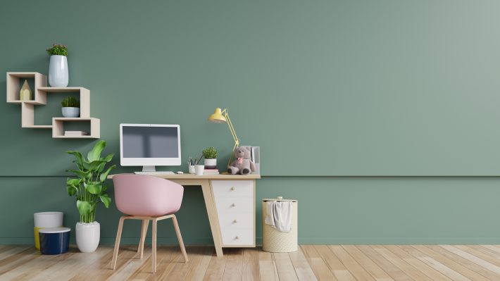
CREATE A ROOM YOU LOVE, YOU’RE GOING TO BE SPENDING A LOT OF TIME IN IT.
Assuming you have committed a room or corner, and some office furniture to work at for your setup, now its time to really claim it. It’s no secret that one of the quickest and least expensive ways to transform a room is with paint. And now that we are working from home more than ever, you may want to consider giving your space some love and paint it! ( I recently wrote a guide on Affordable and Original Art For Your Home Office you may enjoy.)
CHOOSE A COLOUR TO SUPPORT YOUR WORK: Countless books have been written about how to boost your work productivity. Colour and pride in your space are definite drivers to productivity, creativity, and creating a space for you. In this post, I’m sharing with you the most popular home office paint colours.
NOW HOW TO CHOOSE THE RIGHT OFFICE PAINT COLOUR?
Choosing the right paint colour, however, can be tricky. It’s always recommended to paint a few sample colours in the room you’ll be painting. Both natural and artificial lighting play huge roles in how the hues appear at different times during the day. You also need to see how the colour interacts with existing furnishings, like your carpet, furniture, fabrics, and more.
See below some of my go-to paint colours, which can help promote a productive space, make your office feel more complete, and offer a sense of happiness every time you enter. Honor your office, choose the best paint colours for your home office. You spend a lot of time there to not make sure it feels like your best outfit when you are working.
OUR TRIED AND TRUE COLOURS:
I find that I frequently work with the same colours again and again, coming back to their staying power and perennial freshness. We should all practice trying other colours but these are the ones that I come back to! 1. Grays and Whites, and 2. Blues.
STONINGTON GRAY
And of course, you can’t talk about gray without mentioning Stonington Gray and its sister Coventry Gray. They are both very neutral – not too cool and not too warm – and would like great in the living room, bedroom, and kitchen. I have been using Stonington Gray for many years. I keep trying other grays but keep coming back to Stonington. It’s just so appealing.
NICKEL
Nickel by Benjamin Moore is a gray with blue undertones and is great for a home office space. The colour is light and calming and goes perfectly with rustic wood tones found in furniture. The blue hues stimulate the mind, increase productivity, and help you stay focused!
DESIGN TIP:
Colour can really affect your mood, so when it comes selecting a colour, choose a colour that give off pleasant vibes. I know this sounds a little woo-woo, but ask yourself this question when considering different options. You may find an answer for which is the best home offfice paint colour for you.
SHORELINE
This is a great colour for a home office. It’s a light crisp gray that is calming. I highly suggest you try it as one of your options. This may be the perfect entrance for all your other elements in the room.
CLASSIC GRAY
NOTHING lackluster ABOUT THIS COLOUR. You may not see the gray, but it’s here, and yet this colour is light, bright and warm.
FULL MOON
Full Moon is a calming white, yet fresh and bright. Great for rooms with north facing windows, to keep the lightness of the room throughout the day.
PALE OAK
YES, Pale Oak looks very beige here, but it does have a green undertone. Green is a calming colour and it works well for an office space to help you feel more restful. These undertones become stronger given the other furnishings, their colours or the wood tones that were chosen.
DESIGN TIP:
I am not calling out the colour names on the photos I have offered here, because how a colour looks in a picture, is not how it will look in your home. You have to know that all the pictures in magazines and Pinterest that you see have been altered with filters and printing techniques to create a pleasing and inspiring image, not to represent colour correctly. You must buy sample pots or larger sheets from your designer, to see how it works in your room with the furnishings too.
NICKEL
Yes, I have this colour on both colour sheets. It is a gray, but it has the blue undertones that make it a great colour for both colour families. When it comes to the psychology of colour, Blue is like the sky and water, and it has calming factors. It is not too heavy, and it goes perfectly with rustic wood tones found in furniture.
BLUE NOTE
A strong rich colour is perfect for a home office. If Hale Navy does not work with your furnishings, then this is your #2 go-to colour.
HALE NAVY
Blue in general is a great colour for an office and one that I usually recommend. It is strong, pleasing and calming. Once you walk into a room in this colour, you know you’ve arrived. This is the most popular blue in my book for a reason. This is a great colour for strength and intellectual reflection.
SLATE BLUE
An easy-to-use blue with a good deal of gray, this classic colour is reminiscent of the wonderfully weathered slate found along an age-old pathway.
WEST COAST
The colour of sky. This blue is warm and embracing. I like to also use this on trim areas (windows, crown and base). A great option for a lighter more feminine blue.
BLUE ECHO
THIS IS A COLOUR-LOVERS COLOUR. Hints of gray keeps it from being too bright. You can use this on trims, furniture or on your walls. A rich colour that won’t disappoint, as long as it goes with the other items in your room.
SELECT A COLOUR THAT MAKES YOU HAPPY.
How do you do that? I recommend that you purchase a few sample pots of colours you like whether online or at your local Benjamin Moore Supplier. Paint the top colours you are considering either on the walls or on poster board boards, and live with them for a few days in the room you will be painting. It is important to be viewing them at different times of the day when there are different light intensities. You may be surprised how you like certain colours better at certain times of the day in your work area. Skip this step and you may regret it, or you may end up painting your room twice!
DESIGN TIP:
In feng shui, blue represents the water element: clarity, inspiration, relaxation, renewal, and nobility. Therefore, blue is an excellent colour to use in skills/knowledge, career/journey, and the abundance/prosperity.
THOUGHTS ON SELECTING COLOUR.
Colour can really affect your mood, so when choosing colours, think about which colour gives you pleasant vibes. Remember, though, that some colours work well in some rooms but not in others. Each colour has a unique quality meant for something different, so make sure you know your goals for a room and paint a test in the room first, not just selecting one that is recommended, without trying it out.
DESIGN TIP:
Pick 3 of these colours that you like, any three or more.
There is no wrong answer. All colours go together, pretty much. Colour is personal, and you may like the colour in the fan deck below and above (lighter and darker).
NO, I can’t just tell you what colour to pick. What works well in your room, with your furniture, with your personality and natural light is totally different than in my office. Don’t rush it, stick to the process.
Good luck, and I hope this has inspired and offered you some direction to get started on creating a better space for you. You are important.
Full article with thanks to https://www.dvdinteriordesign.com/blog/home-office-paint-colours-designers-use-again-and-again